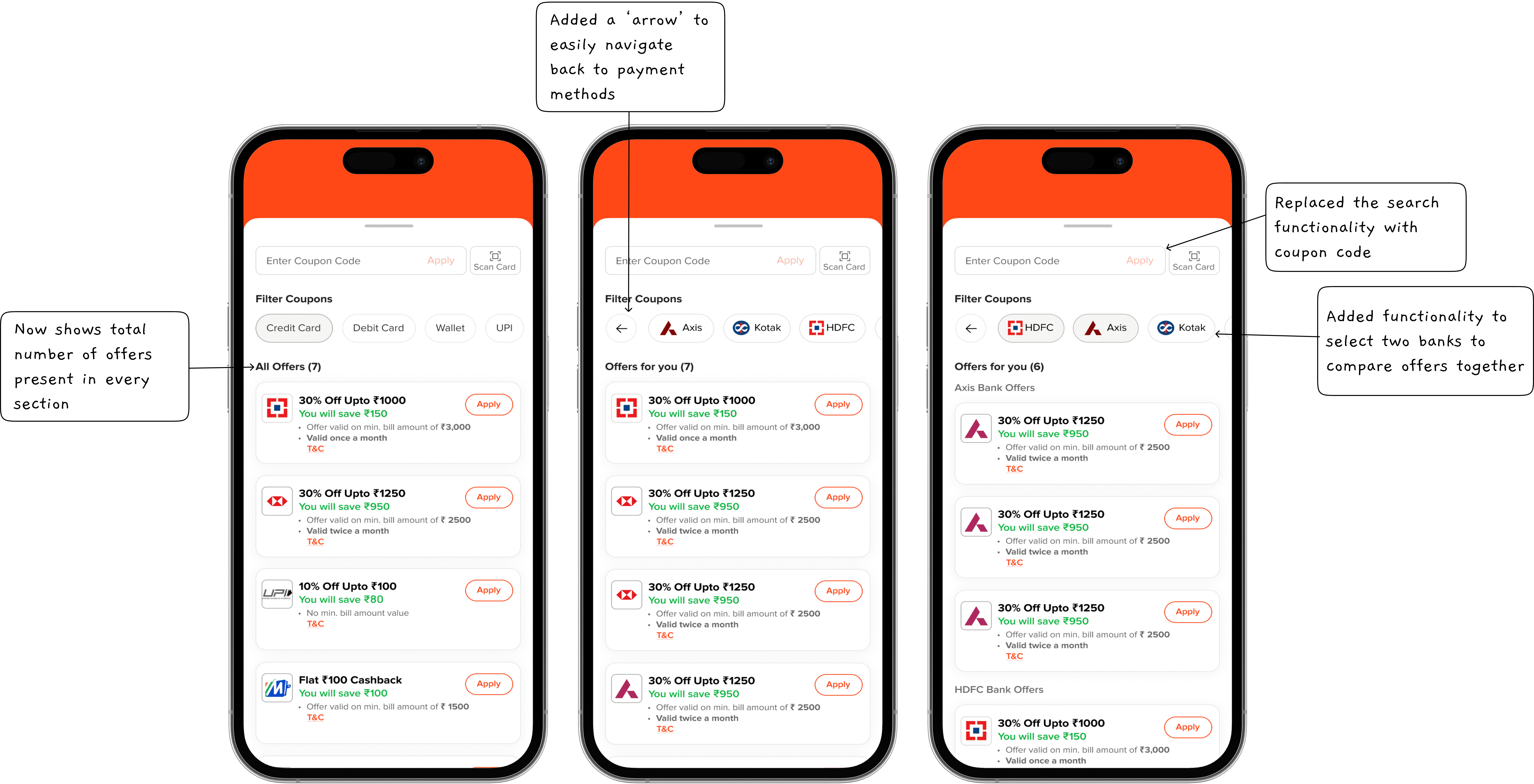
The new Coupon Tray is an interactive panel that lets users view and apply the best discounts within the booking flow. With clear categorization by payment method, card type, and bank, plus improved readability and hierarchy, coupon selection is faster and more intuitive.
Chapter 2: Taking inspiration
The Frustrating Reality: Why Users Dropped Off
It all started with a simple but alarming realization—too many users were abandoning the payment process. The data showed massive drop-offs at critical points, and I needed to find out why.
Users were frustrated, confused, and overwhelmed. They struggled to find applicable coupons, got stuck at payment selection, and abandoned transactions when their expected discounts didn’t appear. Some of the biggest issues included
Low Discoverability: Too many offers, unclear categorization, and an overwhelming UI made it hard for users to find the best deal.
Applicability Confusion: Users couldn’t tell if a coupon is applied to their order.
Limited Personalization: There was no system to recommend the best coupon automatically.
Multiple Coupons, One Choice: Users didn’t know how to compare deals, and stacking wasn’t possible in a clear way.
Hidden Best Deals: The best possible coupon wasn’t visible upfront, making users miss out on savings.
I wasn’t going to reinvent the wheel without seeing what’s already out there. I deep-dived into 50+ apps, from industry giants like Zomato, BookMyShow, Swiggy, Airtel, OYO, and District, to lesser-known but innovative solutions. I categorized them based on their UX/UI effectiveness:
Bad UI, Great UX (BookMyShow) – They used intuitive categorization and sectioning based on payment methods, making navigation seamless.
Great UI, Bad UX (District) – The visual hierarchy guided my eyes perfectly, but essential information was missing.
Bad UI, Bad UX – Some apps made me wonder how anyone managed to apply a coupon at all.
Great UI, Great UX (EazyDiner) – You will be convinced by the end of this case study.
I took inspiration from these insights but crafted a design that solved our specific problems—something no other app had done yet.
Chapter 3: Talking to Real Users
Talking to Real Users: The Unfiltered Truth
I needed to validate my assumptions. I spoke with 20 colleagues in my office, and the insights were eye-opening:
USER 1: I couldn’t find a great deal quickly, so I just paid the full amount instead of hunting for coupons.
USER 2: I always apply the first coupon I see without checking if it's actually the best one.
USER 3: The way discounts are shown is confusing—I can’t tell how much I'm saving, and I don’t trust these offers.
USER 5: I can’t search for my bank card to see which offers apply to me.
USER 6: I don’t want to waste time figuring out offers. Can you just show me the best discount?
USER 7: There are way too many offers, and it’s hard to understand which one applies to me and I need to pay my bill fast.
Armed with these insights, I knew exactly what needed fixing. The next step? writing out problems with the current design.
Chapter 4: The Whiteboard Session
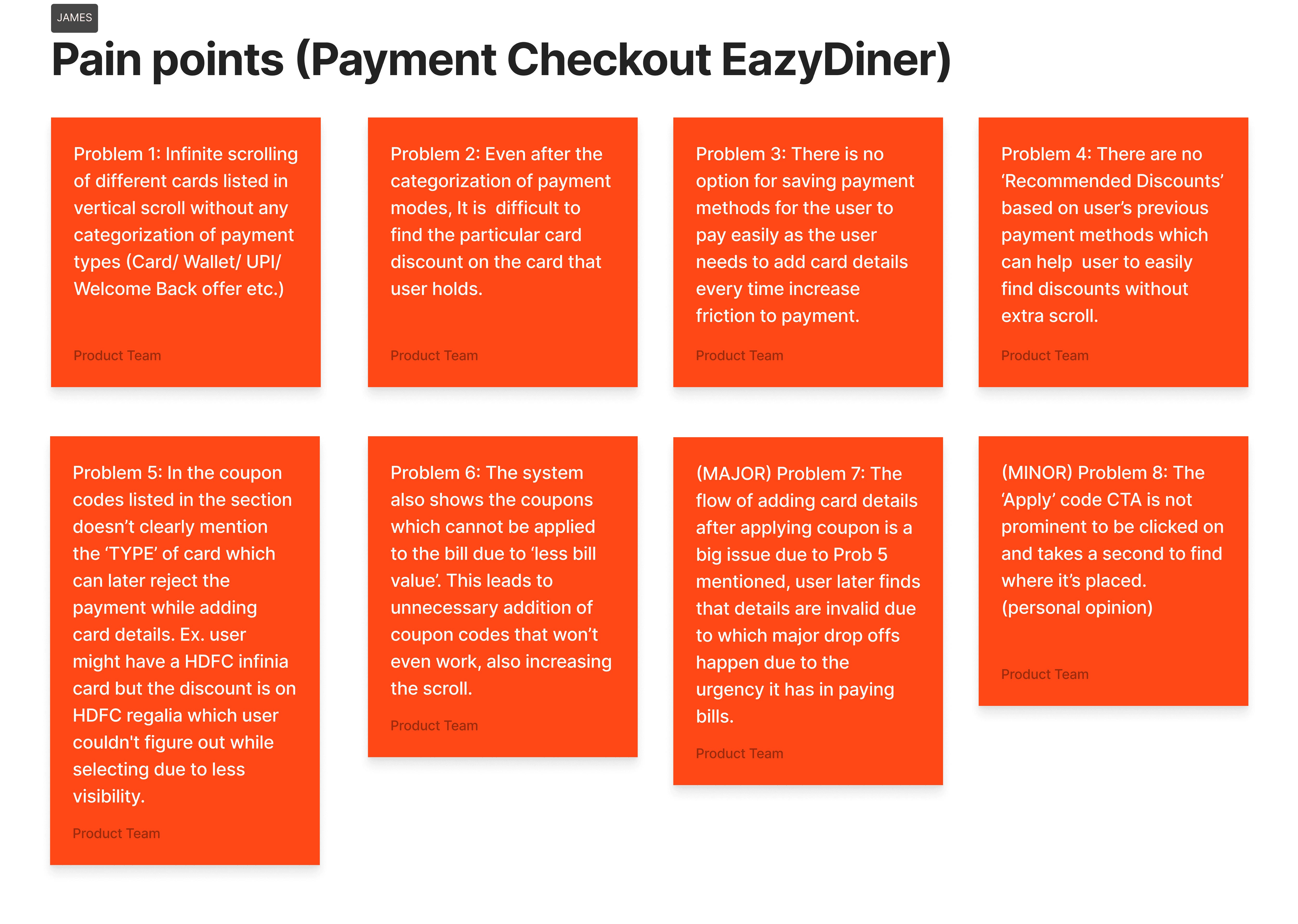
I gathered the team and filled a whiteboard with 40+ pain points, identifying everything that was broken. From this chaos, I distilled
8 core problems and structured a research-driven approach.
Chapter 5: Evolution of the New Coupon System
Iteration 1: The Foundation
Redesigned the coupon tray with search functionality.
Improved text hierarchy so users instantly saw savings.
Introduced coupon 'chips' to make navigation and filtering easier.
Iteration 2: The Breakthrough
Introduced sub-chips for handling cards of different bank within the space after selection of payment method.
Challenge: Users couldn’t compare two banks simultaneously, leading to confusion when selecting the best offer.
Initial iterations didn’t have a clear distinction between savings categories, which led to redesigning the way offers were grouped and displayed.
Iteration 3: Granular Control
Introduced tabs for “All Offers,” “Credit Cards,” “Debit Cards,” and “Other Offers,” making navigation intuitive.
Displayed the number of offers next to each category for clarity.
Enhanced visual hierarchy to clearly show bank names, discounts, and eligibility.
Improved dynamic UI components, ensuring that the offer list resized smoothly depending on content, avoiding cutoff issues seen in early tests.
Final Iteration: Bringing It All Together
Implemented coupon code entry, searching offers, tabs, sub-chips, and a new UI.
Solved the Axis Bank problem—80+ card types with varying offers. I introduced a system where users entered the first 8 digits of their card to see applicable deals.
Redesigned the card scanning function to include flashlight, photo upload, and rotation for easier use.
Overcame technical constraints from JusPay, which initially limited UI customization.
Fixed tap area issues, dynamic height problems, and UX inconsistencies.
Added smart recommendations, where the system highlights the best savings based on the user’s selected payment method.
Chapter 6: The Project Hand-Off
Once the design was finalized, I conducted a three-hour deep-dive session with the developers to ensure a smooth handoff. During this session, I walked them through the core problems we identified and why they were important to address. I then explained the design solutions, detailing the logic behind each decision to ensure clarity. We also discussed functionality expectations and assessed technical feasibility, aligning the design with development constraints.
Chapter 7: Design Testing
After the first version was development-ready, I focused on identifying any design discrepancies, bugs, or other issues in IOS and android. I then reported these to the quality assurance team, enabling them to coordinate with developers and implement the necessary fixes. The issues were:
INDIVIDUAL COUPONS
The bank logo width has been reduced. It should have a fixed size of 65 x 22 (width x height).
A ‘Selected Cards’ CTA should be displayed under the bank logo.
APPLY COUPON PAGE
There is a logic issue in the Recommended Coupons section (related to the number of coupons displayed).
When clicking on a payment method (All, Debit Card, Credit Card...), the tabs should be dynamic and shift to the center for better readability. When deselected, they should shift back to their original position.
What is logic behind priority/ranking of the coupons displayed to the user.
PAYMENT METHOD TABS
When switching from All to Credit Card, the view section does not move to the top but stays where it was under All.
The Search tab remains in an active state even when the keyboard is not present.
Chapter 8: Tracking With Key KPIs
The real test is in the data. These are the KPIs I’ll track post-launch:
Conversion Rates – Payeazy conversion for old and new users.
Coupon Engagement Rate – How many users interact with the coupon section.
Coupon Redemption Rate – How many successfully apply coupons.
User Satisfaction (CSAT/NPS) – How people feel about the new experience.
Customer Support Tickets – Fewer coupon-related queries mean better clarity.
Chapter 9: If I Had More Time…
If I Had More Time…
I’d go back to the first payment screen, which still has a 16% drop-off rate. Making the amount entry process smoother could have a huge impact.
Last Chapter: Biggest Learnings
Data > Opinions :–
Instead of relying on assumptions, I used real user data, research, and usability testing to inform design choices. This ensured the design addressed actual user needs, improving engagement and usability.
Teamwork Drives Success :–
Collaboration was key—regular feedback from colleagues, developers, and senior designers helped refine the design. Their insights uncovered blind spots, improved usability, and ensured alignment with user and business goals.
Document Everything :–
Maintaining clear documentation of issues, iterations, and decisions streamlined communication and problem-solving. It also helped track progress and ensured consistency throughout the project.


