

Coupon Hunter
Finding the Best Coupon Shouldn’t Feel Like a Treasure Hunt


My Role
led the end-to-end redesign of the PayEazy coupon selection experience.
Timeline
January 2025 – April 2025 (4 months)
Team
1 Product Manager
3 Devs
2 QA Engineers
1 Head of Product
Outcome
Coupon application: 55.5% → 67.0% Payment success: 34.6% → 45.6% Filter engagement: ~18% → ~42%
Getting the Metrics
Enter Amount

100 Users
Payment Summary

84 Users (-16%)
Payment mode

50 Users (-40%)
Payment Success

36 Users (-16%)
Users came to PayEazy with one clear goal to get a discount while paying their bill.
But this is where things started to break.
Nearly 40% of users dropped off when moving from the payment summary to selecting a payment mode.
Overall, only 36 out of 100 users successfully completed the payment.
Users wanted the discount, but many could not confidently apply the right coupon. Instead of completing the payment, they dropped off. This made improving payment success and coupon confidence the core problem to solve.
Real User Problems


I needed to validate my assumptions so I got the data of real users that raised issues which aligned with the problem statement that I was defining.
USER 1: I couldn’t find a great deal quickly, so I just paid the full amount instead of hunting for coupons.
USER 2: I always apply the first coupon I see without checking if it's actually the best one.
USER 3: The way discounts are shown is confusing—I can’t tell how much I'm saving, and I don’t trust these offers.
USER 5: I can’t search for my bank card to see which offers apply to me.
USER 6: I don’t want to waste time figuring out offers. Can you just show me the best discount?
USER 7: There are way too many offers, and it’s hard to understand which one applies to me and I need to pay my bill fast.
Armed with these insights, I knew exactly what needed fixing. The next step? writing out problems with the current design.
Defining Problem Statement

I gathered the team and filled a whiteboard with 40+ pain points, identifying everything that was broken. From this chaos, I distilled 5 core problems and structured a research-driven approach.
Low Discoverability: Too many offers, unclear categorization, and an overwhelming UI made it hard for users to find the best deal.
Applicability Confusion: Users couldn’t tell if a coupon is applied to their order.
Limited Personalization: There was no system to recommend the best coupon automatically.
Multiple Coupons, One Choice: Users didn’t know how to compare deals, and stacking wasn’t possible in a clear way.
Hidden Best Deals: The best possible coupon wasn’t visible upfront, making users miss out on savings.
My Primary Goal
Help users quickly find and confidently apply the best coupon so they can complete their payment without hesitation.
⏱️
Faster Decisions
+
🎯
Smarter Results
+
💡
Lesser Duration
=

Coupons
Analysing the competition

Zomato

Swiggy

Bistro

Myntra

OYO Rooms

BigBasket

MMT

Ajio
I wasn’t going to reinvent the wheel without seeing what’s already out there. I deep-dived into 50+ apps, from industry giants like Zomato, BookMyShow, Swiggy, Airtel, OYO, and District, to lesser-known but innovative solutions. I categorized them based on their UX/UI effectiveness:
Bad UI, Great UX (BookMyShow) – They used intuitive categorization and sectioning based on payment methods, making navigation seamless.
Great UI, Bad UX (District) – The visual hierarchy guided my eyes perfectly, but essential information was missing.
Bad UI, Bad UX – Some apps made me wonder how anyone managed to apply a coupon at all.
Great UI, Great UX (EazyDiner) – You will be convinced by the end of this case study.


I took inspiration from these insights but crafted a design that solved our specific problems—something no other app had done yet.
Evolution of Design

Iteration 1: The Foundation
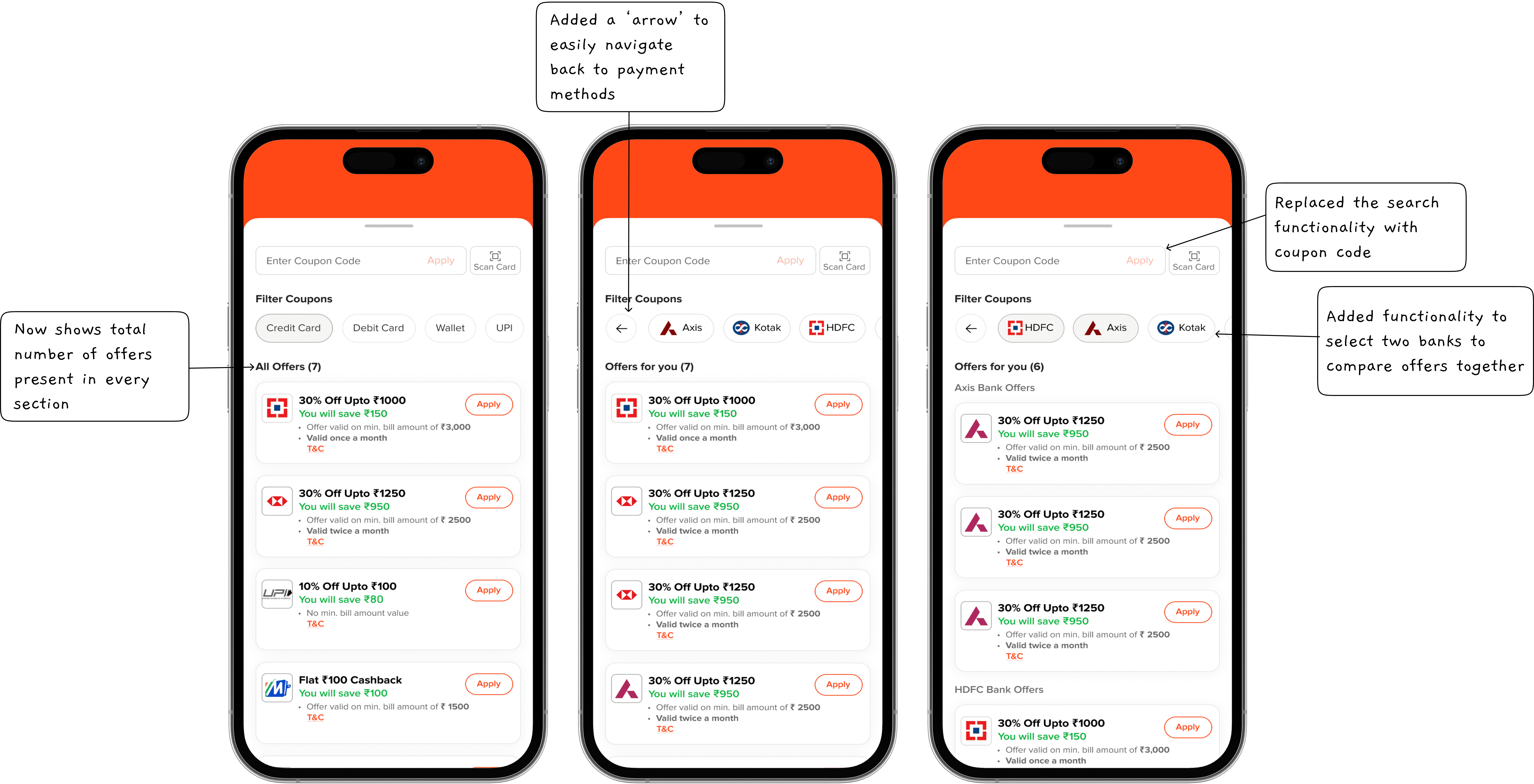
Redesigned the coupon tray with search functionality.
Improved text hierarchy so users instantly saw savings.
Introduced coupon 'chips' to make navigation and filtering easier.

Iteration 2: The Breakthrough
Introduced sub-chips for handling cards of different bank within the space after selection of payment method.
Challenge: Users couldn’t compare two banks simultaneously, leading to confusion when selecting the best offer.
Initial iterations didn’t have a clear distinction between savings categories, which led to redesigning the way offers were grouped and displayed.

Iteration 3: Granular Control
Introduced tabs for “All Offers,” “Credit Cards,” “Debit Cards,” and “Other Offers,” making navigation intuitive.
Displayed the number of offers next to each category for clarity.
Enhanced visual hierarchy to clearly show bank names, discounts, and eligibility.
Improved dynamic UI components, ensuring that the offer list resized smoothly depending on content, avoiding cutoff issues seen in early tests.

Final Iteration: Bringing It All Together
Implemented coupon code entry, searching offers, tabs, sub-chips, and a new UI.
Solved the Axis Bank problem—80+ card types with varying offers. I introduced a system where users entered the first 8 digits of their card to see applicable deals.
Fixed tap area issues, dynamic height problems, and UX inconsistencies.
Added smart recommendations, where the system highlights the best savings based on the user’s selected payment method.
The Experience in Numbers
How It Works

Semantic Search
AI builds a natural language search prompt from your inputs, learning preferences with every swipe for hyper-relevant hotel results.

Smart Filters
AI instantly adapts filters to match the exact meaning of your typed search queries.

AI Recommendation
The swipe engine instantly adapts to your likes and dislikes, re-ranking hotels on the fly for smarter, more relevant suggestions.

Edit Prompt
Prompt bar stays editable so you can instantly tweak location, budget, or preferences without restarting your search.

Seamless Flow
Effortlessly transition from listing to details to complete bookings faster without breaking the experience.

Collections
All right-swiped hotels are auto-saved in a wishlist stack, ready for easy review anytime.

Search Recall
Quickly resume sessions by instantly viewing and reusing previous searches without starting over.

Special Themes
Occasion-specific themes like Valentine’s personalize results and improve AI accuracy for better property matches.
The Result
The prototype was showcased to the Chief Technology Officer, Chief Marketing Officer, and Head of Design at MakeMyTrip, receiving strong appreciation. It went on to secure the Runner-up position among 20 teams and over 100 participants across the Gurgaon and Bangalore offices.”
The Final Prototype
The User Interface
ONBOARDING
Guides users through a quick setup to personalize their experience.


SEMANTIC SEARCH
Search and refine results semantically through natural voice/text queries.


GenAI STACK
Confirms a new AI-powered stack has been successfully generated.


PROMPT SEARCH REFINING
Helps users fine-tune their prompts & add filters for more accurate results.


COLLECTION STACK


